Cake Industries designer David Knight was responsible for the winning design in a competition to create the IABSE Awards Trophy. Here he talks about how the process evolved:
As a bridge engineer, I’m used to a design process that is heavily constrained with common solutions and three basic materials to chose from. In contrast, the process of designing an award trophy was
incredibly difficult! With almost no constraints, and almost any material to choose from, I developed a new-found respect for product designers.
To narrow it down, I developed a few constraints of my own:
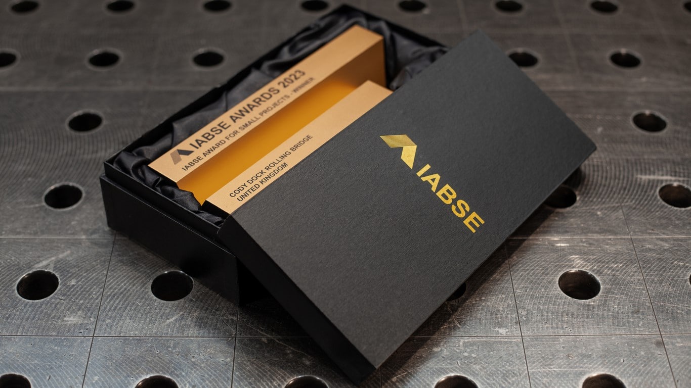
- It had to be light enough and small enough to comfortably hold in one hand.
- It had to have a clear geometric and three-dimensional identity – as the IABSE Awards are new and will become the premier international awards for bridge and structural engineering design, it would not be acceptable to deliver something that only worked in 2D or was graphic in appearance.
- It had to represent IABSE.
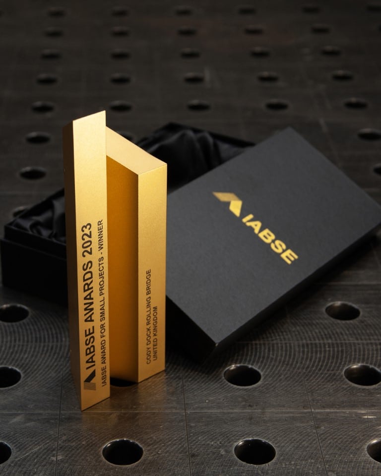
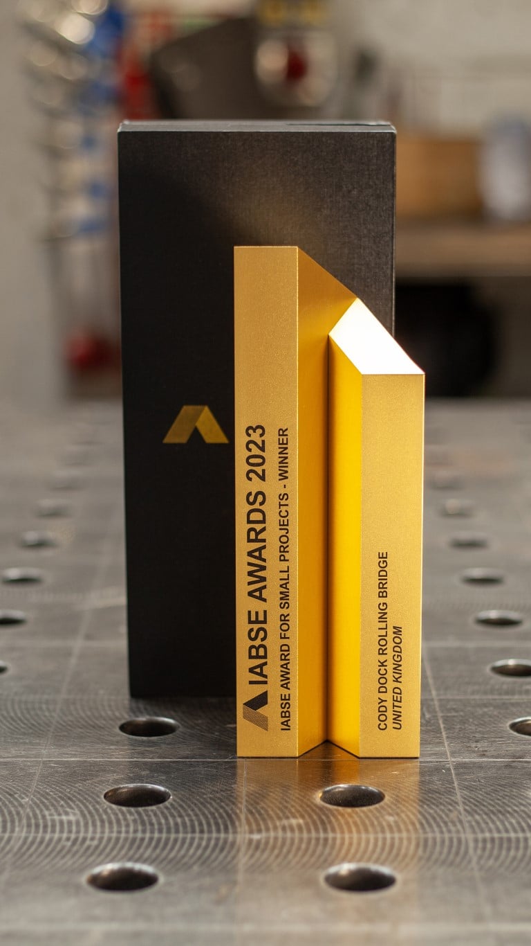
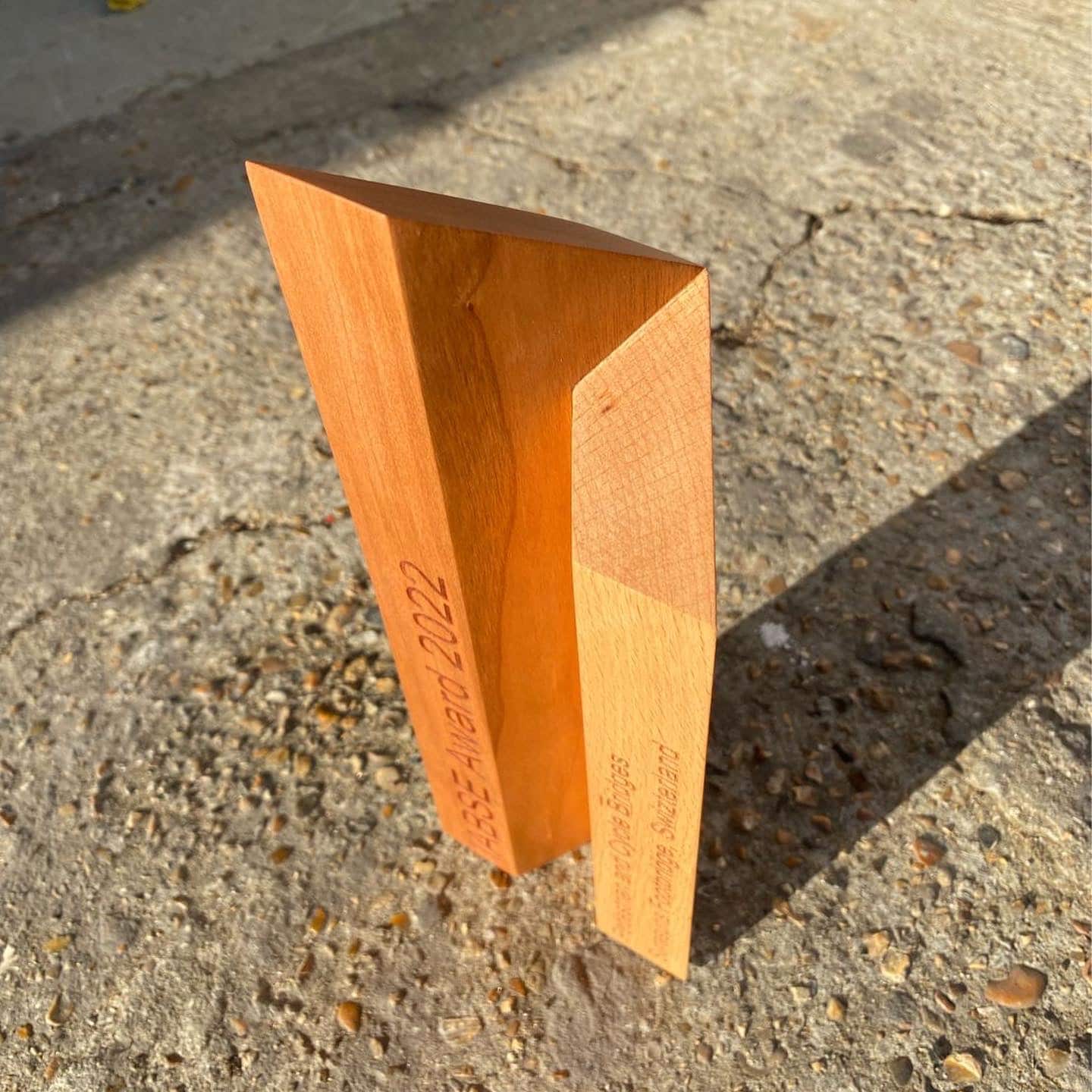
The final form was developed out of the beautifully simple shape of the IABSE logo. Developed in 1976 by the Japanese Group for the 10 the IABSE Congress, the logo represents “an ideogram of “human being”; and also the sacred mountain, with slopes covered by green pine-trees aflame in the setting sun”. It was adopted by IABSE internationally as it was seen to capture the fundamentals of technical expertise: mankind, nature, and spiritual endeavour.
It is also geometrically resolved, and can be formed from seven smaller equilateral triangles, or from a larger one with two small triangles removed. To create a three-dimensional form, the logo is extruded upwards, with each half truncated at the same 60-degree angle to attempt to recreate this perfection in elevation. Perhaps it could be considered similar in form to a skyscraper, but the subtle abstraction prevents any direct relationship to the forms of potential winners.
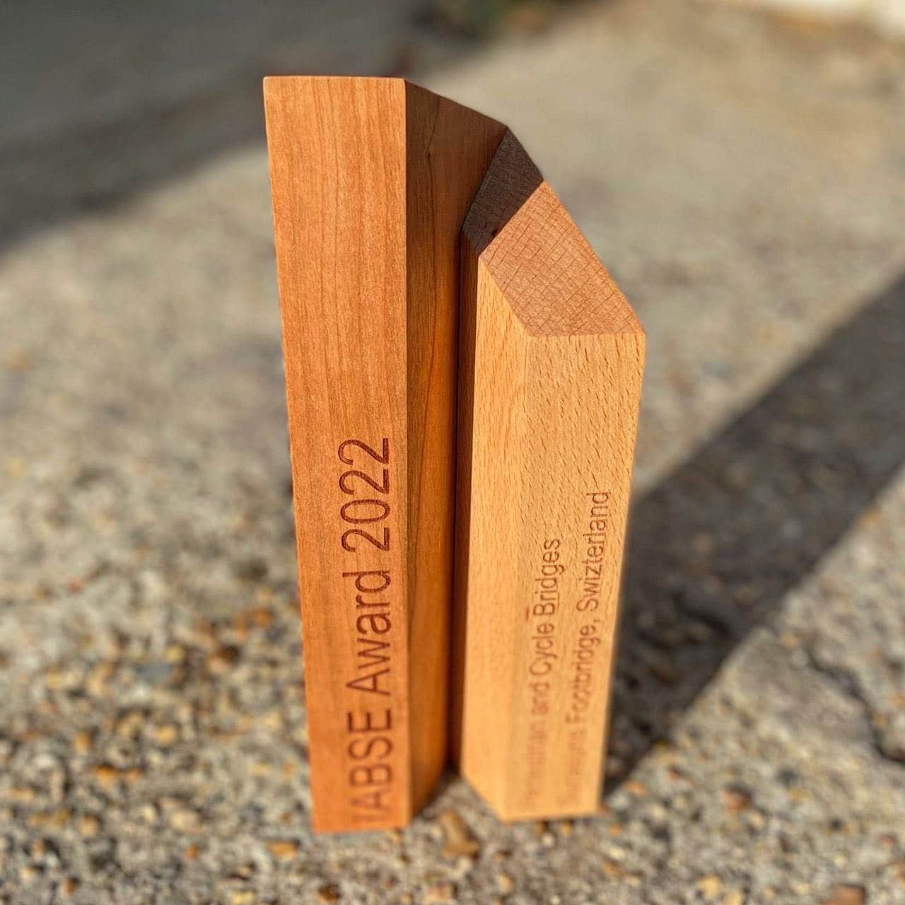
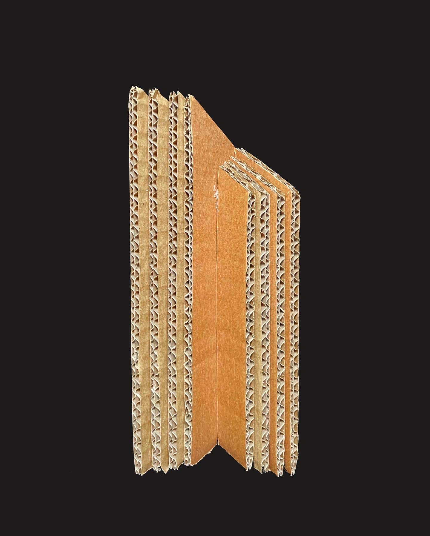
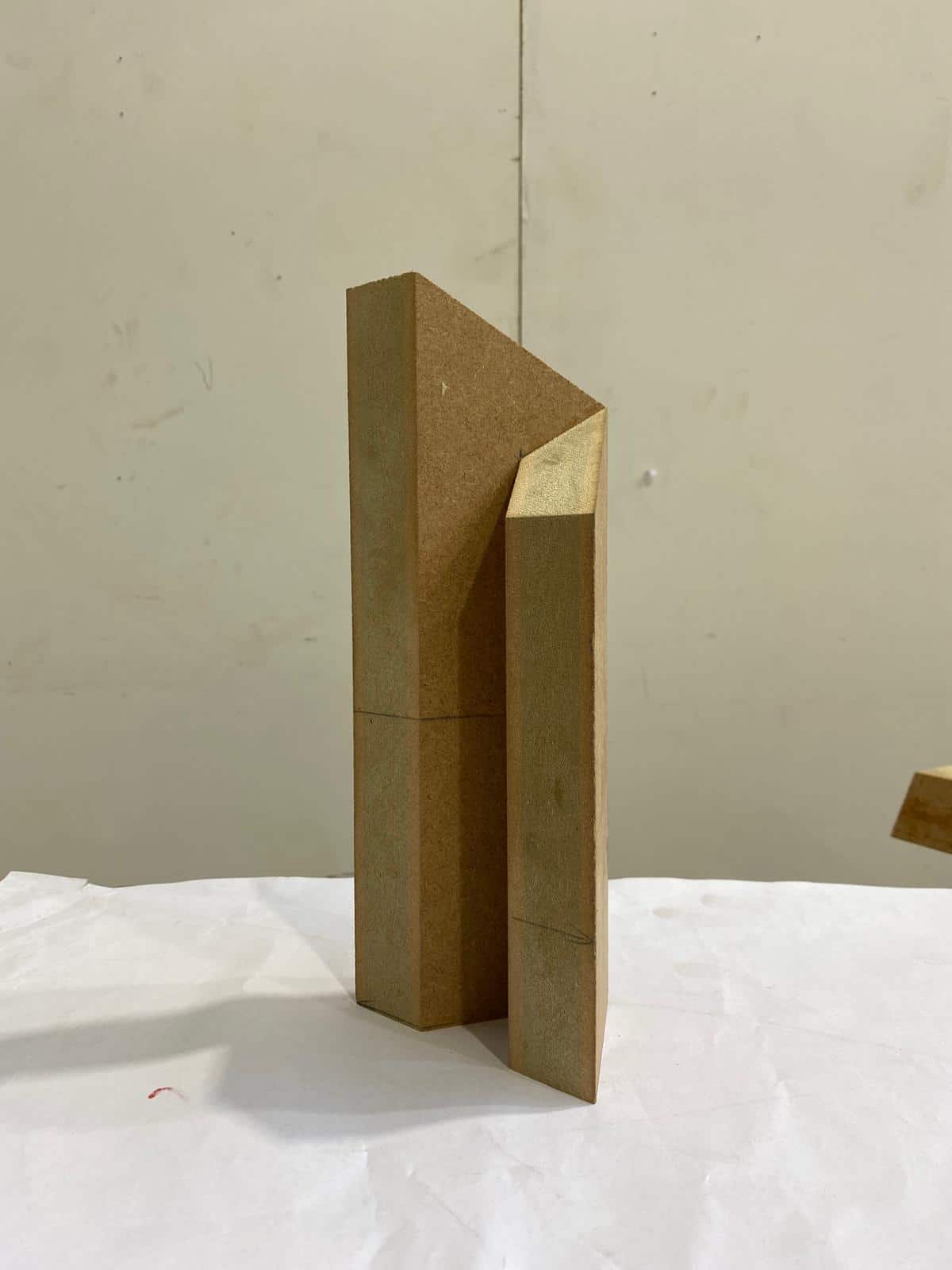
Materially, the original intent was that it was fabricated from two species of timber to reflect the colours of the original logo. I had hoped that we could create a sustainability narrative by reusing timber that had been reclaimed from repaired bridges and boardwalks. After a process of prototyping (in cardboard, then MDF, and then hardwood) the design was handed over to the awards team to develop the final object.”